Prototyping the User Interface
In my previous post, I described how I train for a running race and how I’m hoping to replicate and streamline that process with an app. But before I get waist deep in JavaScript, I want to step back and sketch out the design, so that I have something to refer back to as I build out the app. In this post, I describe my process for turning an idea into a low-fi prototype.
I set myself a few loose requirements for this prototype. I wanted to capture the three main screens of the app: the empty state, the training log, and the individual workout edit screen. I decided to design for a desktop web browser first, and revisit mobile later on.
My Process
When I start working on a project that involves some sort of user interface, I usually have a rough mental image of how it should look. I use that as a starting point, and pull in other ideas as needed. I typically design from the outside in, starting with the large visual elements before moving to the more specific details. Once I have the bones of the design, the remainder of the process is all about iterating until I have something that I could feasibly turn into a functional prototype.
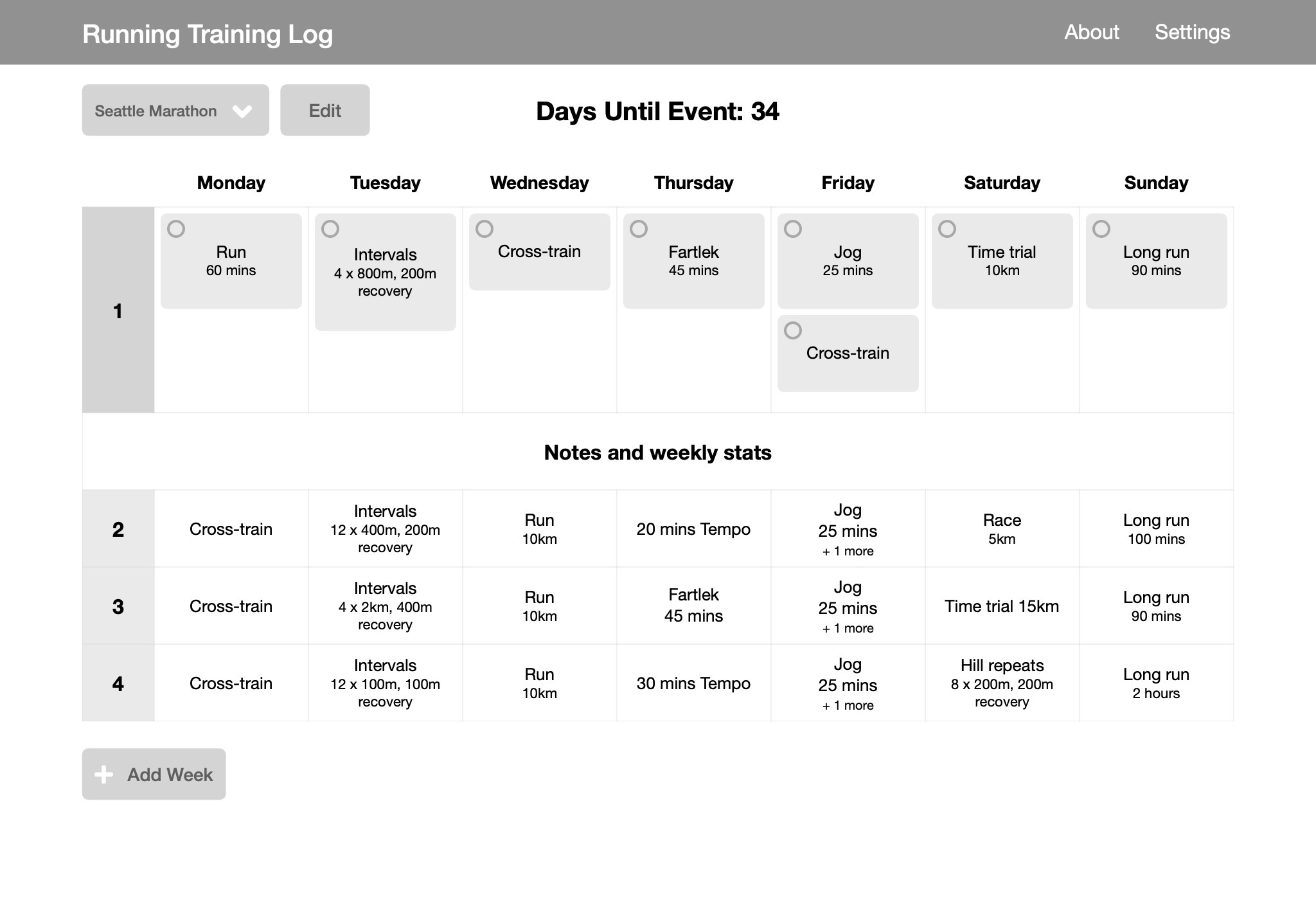
Take the training calendar below as an example. I started with a seven column table for the days of the week. I started filling the table with a week of training, but realized that some days I do multiple workouts—Fridays I will typically do a jog in the morning and a strength or stability workout in the evening. So I switched to separate cards for each workout within the day column. There is nothing more satisfying than checking off something when you’re done, so I added the circular checkboxes to each card.
A few loose rules I follow when prototyping:
- Use accurate content where possible to see how it works within the design.
- Only use grayscale colors.
- Do not use photographs or images. Use icons sparingly.
- Do not be tempted to add UI elements or features just because they are common. Less is more.
- Focus on the parts that are unique or important to the design. Boilerplate can come later.
These rules basically boil down to one principle: Don’t get caught up in the visual details.
Tools
There is no universally best tool for prototyping. Whatever allows you to get your ideas down quickly, and in a persistent form, is the best tool. But here are some of the tools I reached for in this project.
Keynote
If I get a stroke of inspiration, pencil and paper is often the fastest way to capture the idea. But this project was simple enough that I started at my computer. I’ve tried several other tools, and each time I find myself coming back to Keynote. The features that make Keynote ideal for the task are the alignment guides, which make it easy to lay things out in a consistent way, and the fluidity of the animations and interactions i.e. zooming, panning, and resizing.
Font Awesome
I mentioned above that, in general, I use icons sparingly, but there are certain UI elements that need an icon, either to indicate their functionality or for emphasis. For this prototype, I used the free Font Awesome icon font. Check out Getting Started on the Desktop for installation instructions. If you’re using Keynote, you’ll need to save, quit and reopen the app to load the font the first time.
To use the icons, either search on the Font Awesome website, or visit their cheatsheet where you can click on any of the icons to highlight it, and then copy and paste directly into Keynote. Easy as that! Since the icons are characters in a font rather than raster images, you can change the color by highlighting and changing the text color.
Prototype Designs
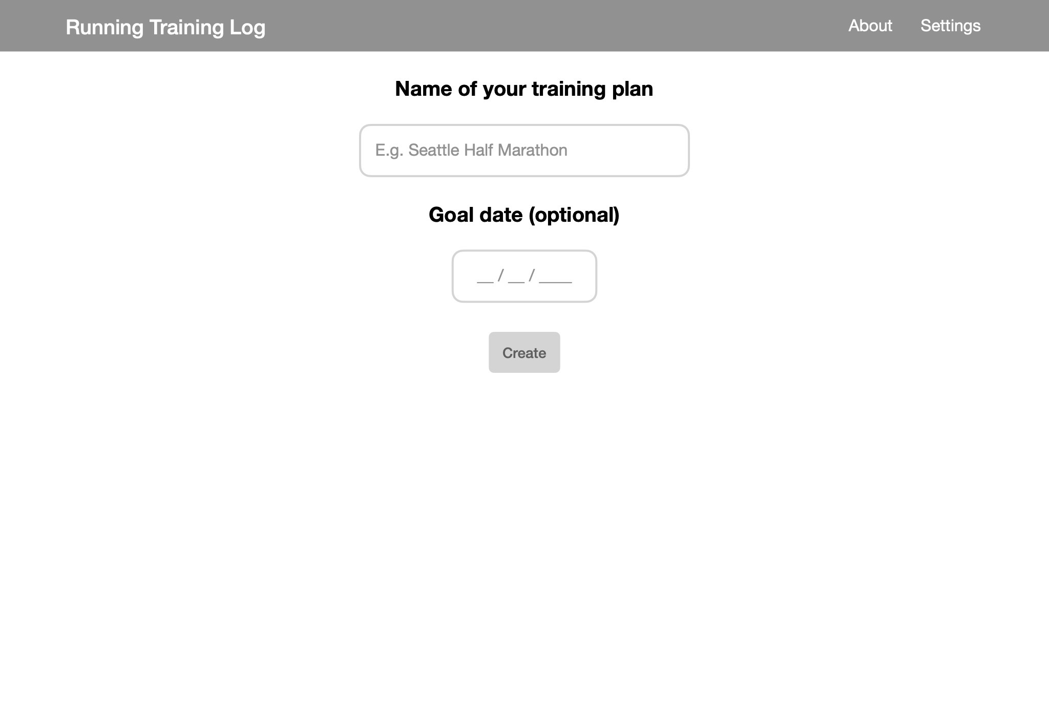
Empty State
This is the first screen that a new user will see. It is so tempting to go overboard with this screen, but if Google has taught us anything, it is that sometimes the best design is just a text box.
Training Log
For completeness, I filled in four weeks of training. One of the decisions I made here was to emphasize the current week, and only show a snippet of information for subsequent weeks. This and other decisions will be much easier to validate when I move to a working prototype.
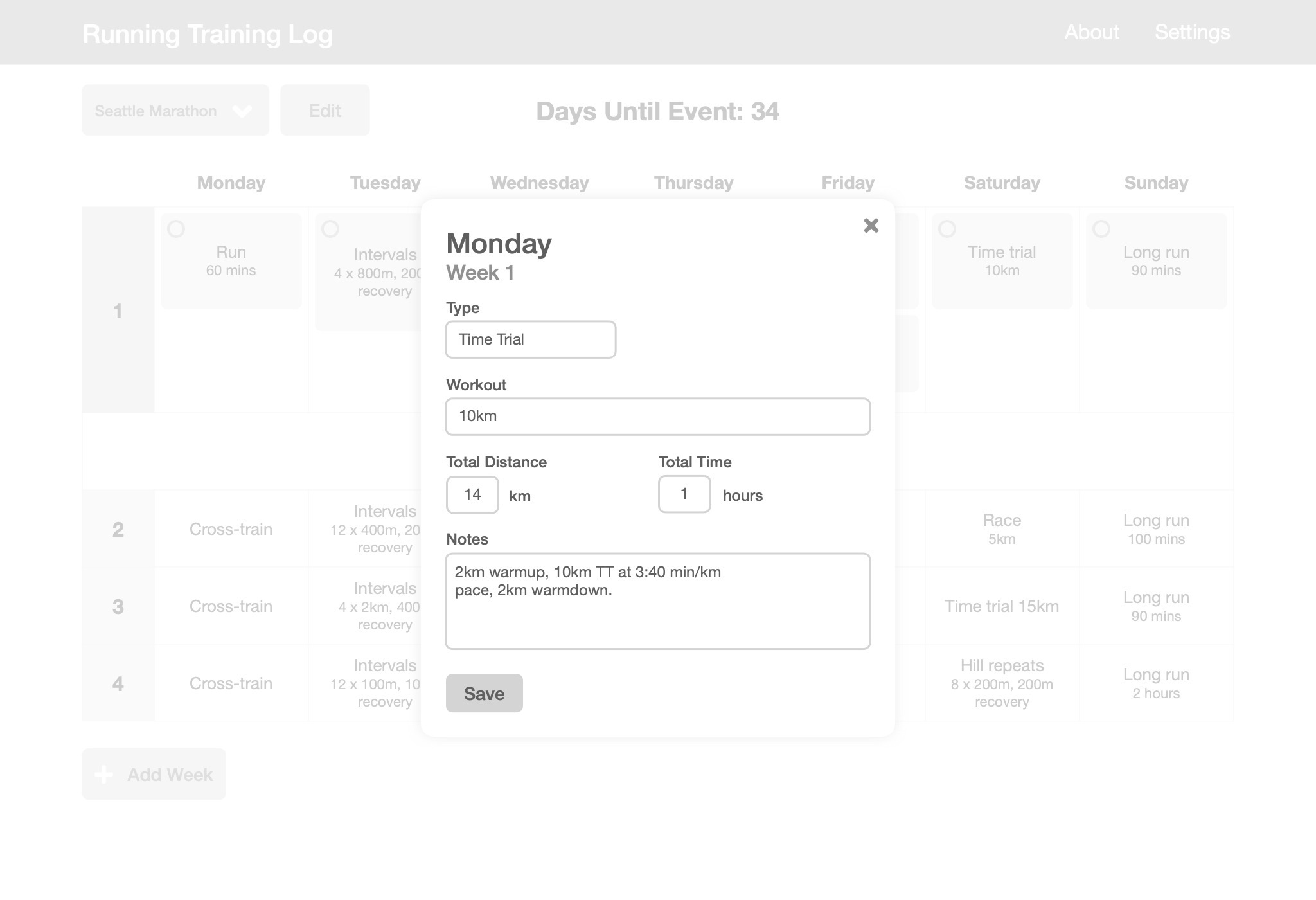
Edit Workout
Data input is such a key component of most apps, that I probably spent the most time thinking about this screen. The main question I had (still have) is how much or how little information I need for each training. After all, I could have made it a simple text box. But maybe having the “Type” field as a dropdown or autocomplete, with a separate box for the specific workout, will make inputting data faster.
It is far from complete, but at least I now have something that I can begin to implement without having to think too hard about the design. Some ideas are easier to validate in a working prototype, so the design will no doubt evolve. To that end, the next step is to write some code.